Kate Woodle is a member of the West/Central New York SCBWI region and also helps facilitate the Syracuse area Shop Talk. She worked as an illustrator at the Rosamond Gifford Zoo in Syracuse, NY for more than 25 years. One day we got chatting about picture books, and I asked her whether her zoo work gave her insights into picture book illustration. Here's what Kate has to say about that:
Working at the zoo was my dream job. It was creative (I was the exhibit designer) and it involved animals. I got to study the animals in our care, learn about their habitats and the food they ate, the environment and conservation issues affecting them, and then present their "story" to the public.
I created illustrations and designed signs for exhibits. The zoo's educator wrote the signs. As an illustrator, my job was to get people to stop and read the sign. Then I could convey some additional information through the art, such as what food an animal eats, where it lives and what its habitat is like. This frees the zoo educator to address another topic.
Exhibit illustration is a collaboration much like that between picture book author and illustrator. The biggest difference: in a zoo you have only seconds to catch a visitor's attention. It's harder than it looks. Not only that, you’ve got a limited number of words – hopefully no more than 40 on a sign (pretty close to the recommended number of words per page in a picture book). Sure, this "rule" can be broken, but it does help if you are trying to hold attention. If the sign is meant to be read by an adult who will then interact with the child, you have a little more leeway with your word count.
The illustration for this display helps a child visualize what the words mean. This sign is placed next to a life size baby elephant statue (I made that, too) so that kids can compare their weight, height and how much they eat to that of a baby elephant.
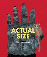
A great example of this in a picture book is "Actual Size," by Steve Jenkins. A gorilla's hand and a pigmy mouse lemur are shown full size on a spread. Not only does the book show the actual size of each animal or part of an animal, it has an interactive element: a child can place their hand on top of the gorilla's to see the difference. A pigmy mouse lemur's whole body can be covered by a child's hand.
The book also has a fold out page to accommodate a Goliath frog that's 36" long. Jenkins’s amazing illustrations are all done with paper collage.
I also painted murals, both in exhibits and in public spaces. A mural is like a scene in a picture book. It gives all kinds of information that is not conveyed in the text: Does this animal live in a rainforest? What other plants and animals live there? Is it misty and damp with really tall trees, a hot dry African savannah, or the Grand Canyon?
In Jason Chin's book, he does a great job showing both detail and scale as he takes you from the bottom of the canyon to the top.
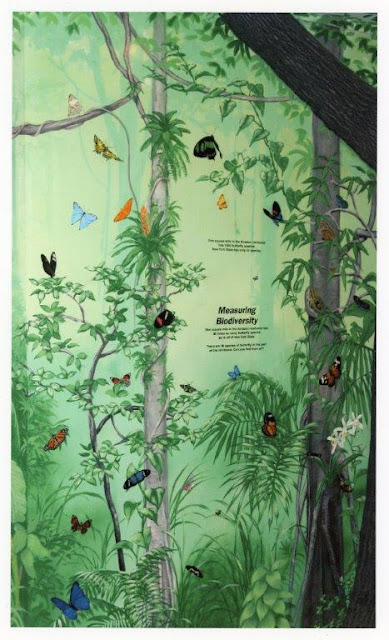
Murals and signs can also be interactive. Here's an example of an interactive mural that represents the Amazon Rainforest.
The text on the mural reads:
Measuring Biodiversity.
One square mile in the Amazon rainforest has 30 times as many butterfly species as in all of New York State. There are 30 species of butterfly in this part of the rainforest. Can you find them all?
As in the butterfly mural, an illustration can convey a sense of place and add depth to a text. It can evoke a mood. All the World, by Liz Garton Scanlon and illustrated by Marla Frazee is a perfect example of this. Scanlon's marvelous poem includes all kinds of events: playing at the beach, picking vegetables, etc. while Frazee's illustrations add to the action. While a rainstorm is never mentioned in the poem Frazee's storm meshes perfectly with the text. The illustrations are realistic but also evoke, along with the words, a sense of beauty, joy and community.
I've been interested in illustrating children's books since I was old enough to know that that was a profession, and I'm particularly interested in STEAM books – especially those that feature biology. My job at the zoo encompassed these interests. What I hadn't expected while I was working at the zoo was what a good education it was for illustrating picture books.
Here's another example of an interactive display: It's a photo opportunity showing all the kinds of primates at our zoo. Children are given the opportunity to include themselves in the group while their parents take a photo.
There are so many similarities to the process. Whether it’s art for a zoo exhibit or for a picture book, research is important. You don't want to be accidentally teaching children something that isn't true. For example, polar bears don't really live with penguins! While fantasy and whimsy are wonderful, I believe it's important to be intentional about the message our artwork communicates to our readers.
Kate Woodle has been drawing since she was three years old. She received a BFA at Syracuse University’s School of Visual and Performing arts, then taught art and later worked as exhibit designer and graphics artist at the Rosamond Gifford Zoo in Syracuse, NY. As part of her job she wrote and illustrated the children’s newsletter, MyZoo Jr. Her illustrations and photos have also been featured in Scholastic’s Weekly Reader, National Geographic Kids and in the books, A Friend for Mia, A New Dog, and Newborn Kits (all published by Pioneer Valley Press). She also did several projects for McGraw Hill Education. You can find out more about Kate and see her wonderful artwork at her website, www.katewoodle.com.


No comments:
Post a Comment